
‘Risk’ is a complex concept, which we colloquially tend to associate with dangerous scenarios. However, risk does not necessarily refer to something bad or harmful: from a statistical perspective, risk is neutral and numerical. But that’s not all risk is - it also generates a feeling that depends on each individual’s personal characteristics and situation and therefore the way risks are perceived changes from person to person.
In many scientific articles, especially on health issues, we often find risks that are statistical figures; for example, the risk of dying for covid-19 patients, the risk of developing health problems associated with drinking alcohol, or the decreased risk of developing dementia if we exercise. Whenever you want to explain the magnitude of a risk reported in scientific articles you need to ensure that you are presenting it in an accurate and understandable way. The following points may help you.
These seven steps can help to translate the risks reported in a research article into a much clearer and understandable form.
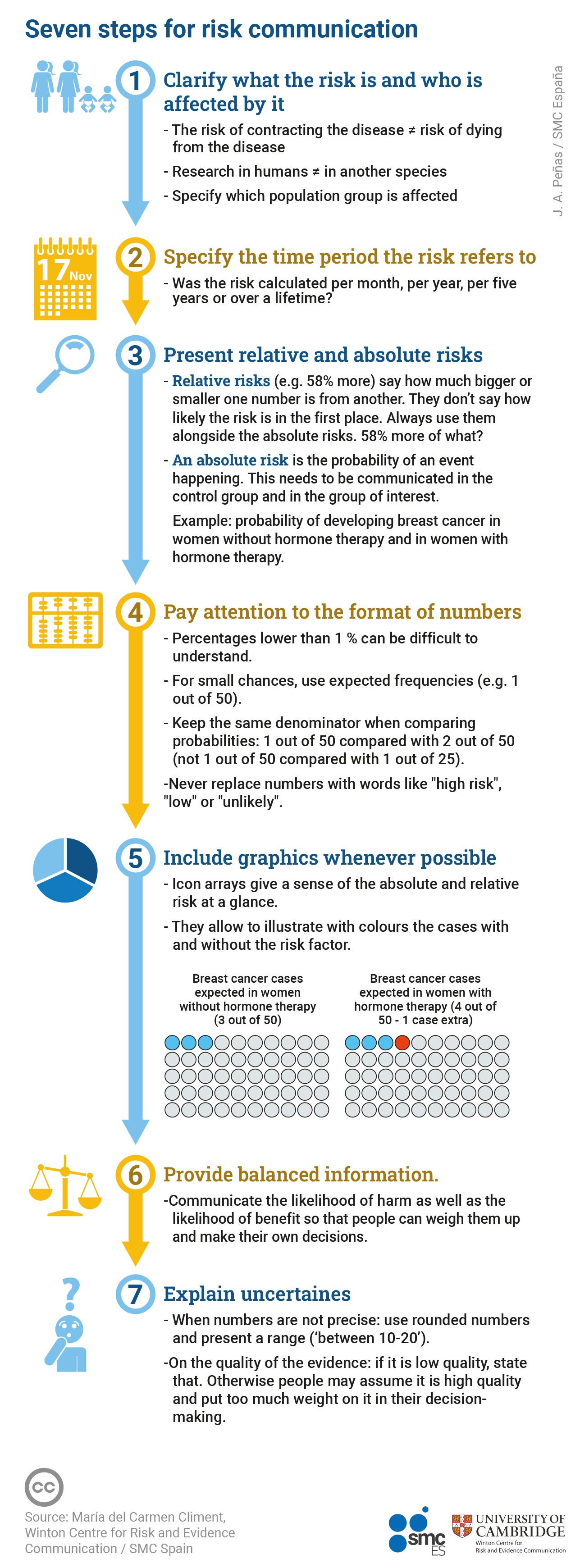
1. Specify what risk you are talking about and who is affected
A common mistake is to talk about risks without specifying what risk you are talking about and who exactly is affected by the risk.
When communicating a risk, we should always be very specific about the outcome we mean. For example, in the case of covid-19-related harm, we would have to specify whether we are talking about the risk of infection, the risk of dying from covid-19, or the risk of hospitalisation.
We also need to specify who is affected by the risk. Firstly, was the research done in humans or in another species, such as mice? If in humans, we should stratify the group we are referring to as much as possible, e.g. hospital patients, the general population, people with a specific condition, men, women, people over 60, etc.
2. Specify the time period over which the risk is estimated
It is very important to specify the time period over which the likelihood of an event was calculated – are you talking about the number of events per month, per year, five years... or over a lifetime?
For example, birth control pills have been associated with one additional case of venous thromboembolism per 7000 users per year; or daily treatment with oestrogen and progestogen for five years is associated with one additional case of breast cancer per 50 female users.
3. In addition to the relative risk, present the absolute risks without and with exposure to the risk factor
-
Relative risk. We often make the mistake of communicating only relative risks, as in "Contraceptive pills double the risk of venous thromboembolism", "The variant of the coronavirus spreading around the world is 58% more lethal", "Hormone replacement therapy for menopause increases risk of breast cancer by a third". Double, 58% more and increases by a third… they’re all relative risks.
Relative risks are not a probability, they indicate how much larger or smaller one number is relative to another, but they are not absolute numbers. That means that a relative risk does not provide any information about the real likelihood of an event occurring. To understand a relative risk, you need the answer to a simple question: double what, 58% more of what, a third of what?
Many academic studies use mathematical methods that produce one of three main types of relative risks: Risk Ratio (RR), Hazard Ratio (HR) and Odds Ratio (OR). Each is calculated in slightly different ways, but what you need to know is that they are all a comparison between two groups.
Relative risks should never be reported alone; they should always be accompanied by the absolute risks in each group we are comparing.
-
Absolute risk. An absolute risk is the actual probability of an event occurring. We are almost always interested in communicating two absolute risks:
a) Absolute risk in the non-exposed group (or ‘control’ group) – also called ‘baseline risk’. E.g. Proportion of people expected to develop dementia among those without diabetes.
b) Absolute risk in the exposed group (or ‘experimental’ group). E.g. Proportion of people expected to develop dementia among those with diabetes.
The following example contrasts the communication of the same evidence using relative risks vs using absolute risks.
Example: Hormone replacement therapy and breast cancer risk
An article in The Lancet, updating the evidence on the association between five years of hormone replacement therapy (HRT) and breast cancer risk, made headlines around the world.
-
How the message was communicated using relative risk only
‘HRT treatment for menopause increases risk of breast cancer by a THIRD, experts warn’. ( The Sun ). “A third” is a relative risk. The magnitude of this risk is unclear without answering the simple question: one third of what?
-
How the message should have been communicated with absolute risks
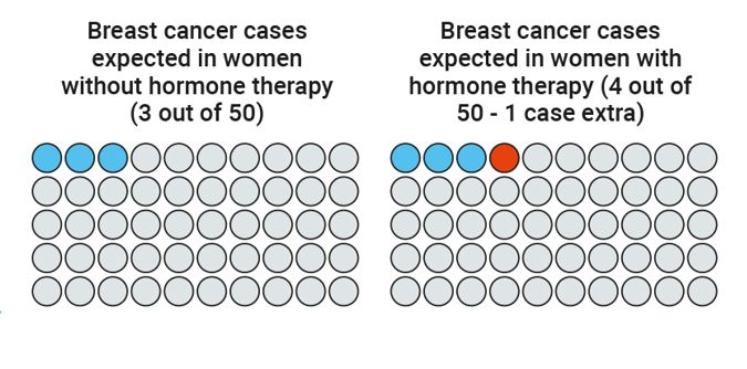
For every 50 women who do not take HRT, three are expected to develop breast cancer. For every 50 women who take HRT, four are expected to develop breast cancer, i.e. one additional case for every 50 users.
El Pais did a good communication of this absolute risk saying: "An analysis of more than 100,000 women shows that daily oestrogen and progestin treatment for five years is linked to one extra case of the tumour for every 50 users".
4.Consider the format of the numbers
The format in which the numbers are presented can also affect how people perceive the risks.
If we want people to be able to compare two numbers – as you often do – they need to be in the same format. It is very hard to compare ‘1 in 30’ with ‘1 in 90’. Which is bigger? Studies consistently show that many people cannot easily tell – the risk with the bigger number in it is actually the smaller risk! Instead:
-
Use expected frequencies with the same denominator, e.g., 3 out of 50 versus 4 out of 50 (never 6 out of 100 versus 4 out of 50) (Yagamashi 1997). Using frequencies helps turn a probability – which people find difficult to think about – into a more solid outcome, something familiar to people and it can be visualised, even if only in the mind.
-
Be careful with low percentages . Percentages are especially difficult to understand when they are smaller than 1%. If you find yourself using a decimal point, try to use a different format! It is usually safer to accompany them with expected frequencies.
-
Never replace numbers with words. Saying that a risk is “high”, “low”, “rare”, “common”, “very likely”, “unlikely”, etc. is ambiguous and each person attributes a different value to it. (Knapp et al 2005).
Be aware that different ways of phrasing a risk make it sound higher or lower to people. There is evidence that, when using percentages, people think the event is less likely to happen than if you use a frequency (‘x out of 100’ or ‘x out of 1000’), while the “1 in x” format dramatically increases risk perception. (Freeman et. al 2021).
5. When possible, use graphs
Graphs can make it easier to understand the magnitude of risks. One example is icon arrays: graphs made up of small icons that represent the number of people in each group we are comparing. Icon arrays help people understand risks, first, because they show absolute risks using expected frequencies, and second, they allow us to visualise through colours the cases that are expected to occur even if they are not exposed to the risk factor (shown in blue) and the additional cases associated with exposure to the risk factor (shown in orange).
Example:
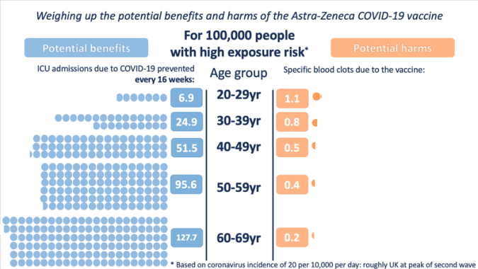
6. Present balanced information, so that the audience can weigh up the potential benefits and potential harms for themselves
When we talk about risk in the context of health (for example choosing medical treatments or interventions) there are almost always two sides to the story: the probability of benefit and the probability of harm. Presenting balanced information means telling these two sides of the story so that people can weigh the information and make their own decisions. It is important not to give a “false balance”, presenting potential benefits or harms that are very different in magnitude as if they were the same (Blastland et al., 2020).
Example: The case of AstraZeneca’s covid-19 vaccine
AstraZeneca’s covid-19 vaccine was associated with an increased risk of developing specific kinds of blood clot. In response, some of the media published stories about deaths associated with taking the vaccine, while others published stories emphasising how many lives had been saved because of the vaccine. In terms of balanced reporting, communicating only the benefit or only the harm is equally misleading.
To allow policy-makers and individuals to weigh up whether or not to use the AstraZeneca vaccine, it was necessary to present both sides of the story: the magnitude of the harm and the magnitude of the benefit associated with the vaccine (and under different circumstances, where the balance may change), the graph below is an example of explaining both perspectives.
7. Explain uncertainties
When people are weighing up information to make an important decision they need to know how certain it is, in order to know how much weight to put on it.
Explaining uncertainties is about being honest about both the accuracy of the numbers and the quality of the evidence that supports them.
-
Uncertainty about the accuracy of numbers
Explaining this type of uncertainty is about presenting uncertainty ranges (confidence interval).
When you analyse data, you will usually produce a range in which the risk encountered is likely to fall because almost all statistical calculations, including of relative and absolute risks, result in a number that can be said to fall somewhere between an expected minimum and maximum value. A basic strategy for explaining this kind of ‘precision’ uncertainty is to report the range within which the risk found could vary. This range may be called the 'confidence interval', or an ‘uncertainty interval’, or ‘margin-of-error’. It may be narrow or wide; the wider the range, the more uncertainty there is.
-
Uncertainty about the quality of the evidence supporting the numbers
Do we have evidence from many studies, totalling thousands of people, estimating that the percentage of people who could benefit from a treatment is between 27-33%? Or do we have a single, small, poorly designed study in which 3 out of 10 people benefited? How do we communicate the two situations differently?
Separately from the direct uncertainty around a number, you can also have uncertainty arising from the evidence that produced that number. Studies suggest that if you don’t warn people that the quality of evidence behind a number is low, then they will assume that you are giving them high quality information and weight it more heavily in their decision-making than might be warranted. It’s therefore a very important role of a risk communicator to help the audience understand when information is based on low quality evidence and therefore the numbers may be out of line with reality. (Schneider C. R 2021).
For risk communication using absolute risks, where to get the numbers from?
Ideally, scientific papers should report absolute risks, but often they only indicate relative risks. If the article does not report absolute risks, then:
-
Obtain the baseline risk; this is the basis for being able to explain the magnitude of a risk. To obtain it:
-
Look for the baseline risk in the paper. It may be in the body of the text or tables. Note: it is rarely explicitly mentioned 'this is the baseline risk', you need to know what you are looking for: the proportion of expected cases in the group without exposure to the risk factor or treatment (e.g. percentage of women expected to develop breast cancer among those without hormone replacement therapy).
-
If the baseline risk is not in the paper, contact the authors and ask them what baseline risk they used.
-
If you don't get there with the options above, use an official source as a reference (e.g. the prevalence of breast cancer in the relevant country according to an official source). This is not ideal, but it is much better than leaving a relative risk alone, with no insight about the real magnitude of the risk.
-
-
Find the reported relative risk. This may be in the form of Odds Ratio (OR), Hazard Ratio (HR) or Risk Ratio (RR). Most often it appears in the abstract and in the results section.
-
Use the baseline risk and relative risk to calculate the absolute risk in the group exposed to the risk factor or treatment. An alternative that will make this step easier is to use RealRisk.

About the author: María del Carment Climént, member of the advisory board of the SMC Spain, is a Science Communicator at the Winton Centre for Risk and Evidence Communication in Cambridge University, United Kingdom, where she researches and teaches courses to improve risk communication in the health sector and journalism. This guide was developed as part of her participation in the book Informando de ciencia con ciencia by FECYT and Lilly Foundation, which will be published in 2023.